Typo: Unveiling the Legacy of Robert Coupland Harding – New Zealand’s Forgotten Typographer

Typo is an outstanding feat by today’s standard; to produce an eight to twelve page, detailed, comprehensive, virtually error free, journal, essentially single-handedly every month; Robert Coupland Harding was a workaholic.

As I stepped into the reading room of the Mitchell Library in New South Wales, my mind brimmed with anticipation. My mission was clear – to delve into the fascinating typographic history of the New South Wales Government Printing Office. Little did I know that this journey of research would lead me to an unexpected treasure – the once-forgotten typographic journal, Typo, by the enigmatic Robert Coupland Harding.

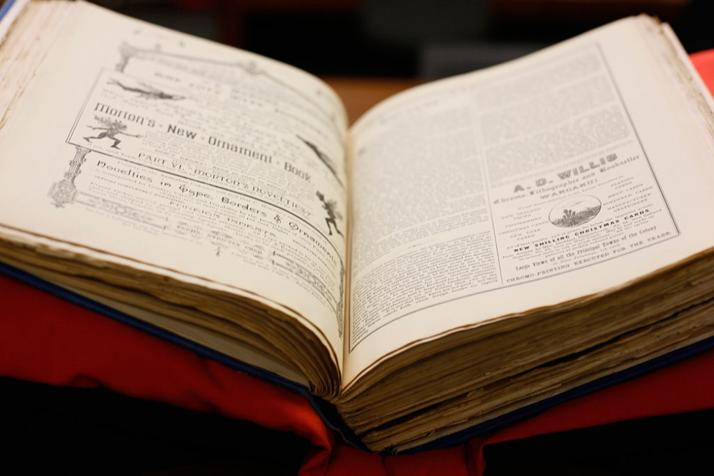
The Mitchell Library, with its vast collection of historical texts and documents, seemed like the perfect place to unearth the secrets of New South Wales’ printing legacy. As I sifted through manuscripts and century-old printing artefacts, I stumbled upon a box that seemed to be nondescript at first glance. But little did I know that within its unassuming confines lay a gem that would electrify my desire for the narrative of typographic history.

Typo, the brainchild of Robert Coupland Harding, captured my attention from the moment I laid eyes on its pages. This forgotten masterpiece was more than just a typographical journal; it was a testament to Harding’s technical brilliance and artistic vision. Within its covers, I found a world of aesthetics and knowledge, coupled with clear instructions for practical printers – a true treasure of the nineteenth-century typographic world.

Pages of pure brilliance: Within the delicate pages, Harding’s influence on the international typographic community became apparent. His network extended far beyond the shores of New Zealand, reaching countries as distant as France, Germany, America, Japan, and Russia. Typo’s significance as a global communication network was undeniable, bridging the gap between distant lands and erasing the boundaries of the imperial “center” and periphery.

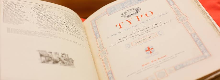
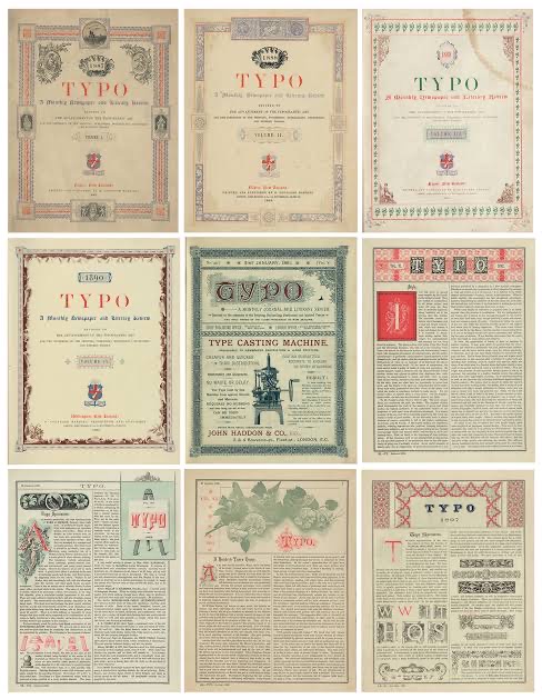
Typo, published monthly as a literacy review and typographic journal between 1887 and 1897 single handedly by Robert Coupland Harding.

As I delved deeper into Harding’s life and legacy, I discovered a man whose passion for printing was only matched by his commitment to social activism and cultural engagement. A man ahead of his time, Harding’s endeavours extended beyond the realm of printing, touching the lives of many through his involvement in various organisations and pursuits.

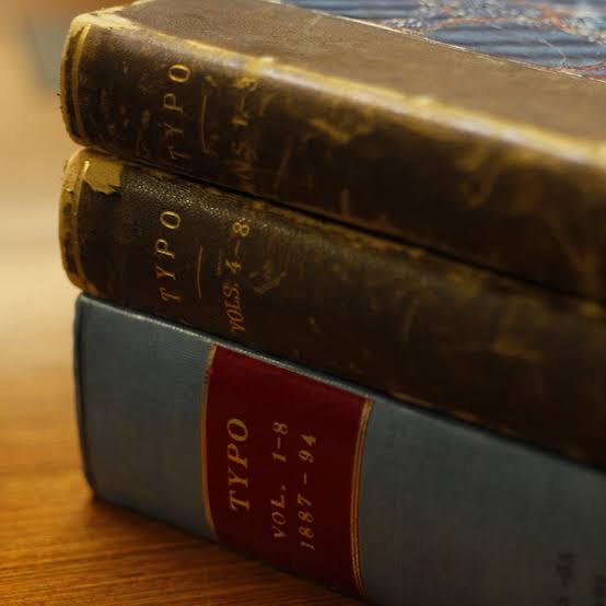
Typo, published between 1887 and 1897, was an iconic landmark in New Zealand’s printing and publishing history. Although revered in its time, the journal was eventually forgotten, until now. Thanks to a three-year research project funded by the Marsden Fund of the Royal Society of New Zealand, Typo has been rediscovered in its entirety. This digital edition now makes it widely accessible, shedding light on Harding’s unparalleled contributions to the typographic world.

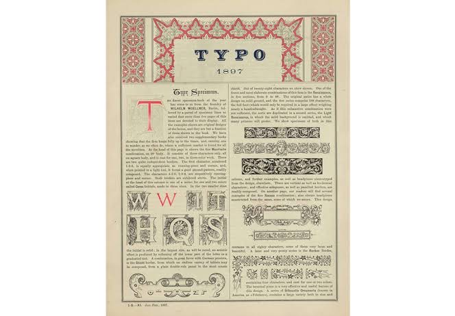
Typo was not just another typographical journal of the 19th century; it stood out for its attention to visual aesthetics. Under the series of articles titled “Design in Typography,” Harding made significant and astute contributions to the global dialogue about aesthetics, offering clear and concise instructions for practical printers. His dedication to the visual display set Typo apart from its peers, making it a truly remarkable publication.

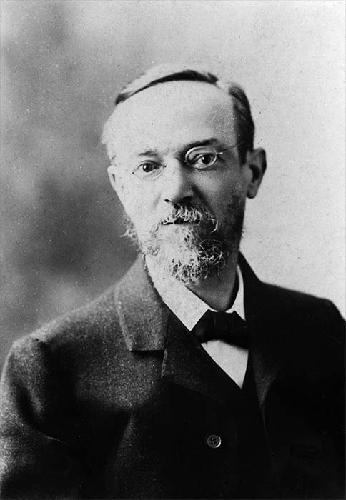
The Life and Legacy of Robert Coupland Harding: Born in Wellington in 1849, Robert Coupland Harding hailed from a family with a rich printing heritage. His father, Thomas Bennick Harding, was a skilled printer and bookbinder who migrated from London to New Zealand. Robert’s journey into the printing world started at a young age, apprenticing with a local printing house. As he honed his skills, he embarked on various ventures, including enlisting in the Napier Rifle Volunteers during the Maori wars and advocating for Maori rights.

Beyond his printing prowess, Harding was actively engaged in social activism and cultural pursuits. He held positions in various organizations, from temperance societies to philosophical societies, and even ventured into politics with the New Zealand Alliance temperance party. Additionally, Harding’s passion for printing extended to creating his own typographic identity, evident in his series of local directories called “Harding’s Almanac.”

The Significance of Typo: Typo marked a turning point in Harding’s career, where his world both narrowed and broadened. While he left mundane printing tasks to others, he established a thriving business that exchanged trade information globally. His network expanded to countries far beyond New Zealand’s borders, making him an influential player on the international market.

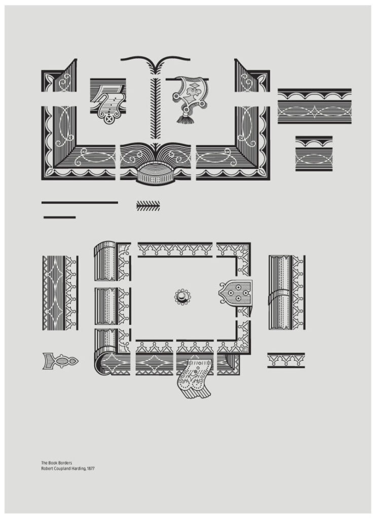
Robert Coupland Harding, The Book Borders, 1877. Digitised by Sai Promsri and Letitia Lam.

The Decline of Typo and Harding’s later life: Despite the accolades and recognition within the printing industry, Typo faced challenges and declined in publication frequency. Harding moved to Wellington in 1890, attempting to revive his business, but the economic downturn thwarted his efforts. Nevertheless, he remained a prominent figure in Wellington, working at the Government Printing Office and contributing to cultural and bibliophilic pursuits.

Coupland Harding died in Wellington on 16 December 1916, survived by his wife, Sophia Sarah Blackmore, whom he had married at Nelson on 15 March 1883, and two daughters and two sons. For all the recognition his achievements received internationally, and his extensive correspondence, he had lived a curiously private life and was something of a melancholic. He was burdened by family anxieties, suffered misfortune in business and had to endure persistent illness. But he was visions ahead of his time, and his aesthetic sensibility and intelligence had a moral dimension which kept him proud in the confidence and independence of his judgement and in his sense of social purpose. It is further testimony to his insight that on the very threshold of the twentieth century he could see printing and typography ‘threatened by the camera, the etching fluid, and by the (at present) harmless and inoffensive “typewriter”, in the keyboard of which lies the germ of something much greater in the future.’

Conclusion: Robert Coupland Harding’s life and work deserve to be celebrated and remembered. Typo, his masterwork, remains an invaluable resource for understanding the nineteenth-century typographical world and its global connections. Through this rediscovery, we can give Robert Coupland Harding the recognition he rightly deserves, positioning him as one of New Zealand’s most accomplished typographers and printers. His impact on the world of visible language and the legacy of Typo will continue to inspire and captivate generations to come.

Let’s do the Nanango.

The Nanango Fallen Soldier Monument. The memorial was unveiled by Major General Sir T.W. Glasgow on the 29 January 1920.

 A chill rural town located about 150 km north-west of central Brisbane. This place has some serious history.

First off, Nanango got its name from the Nanango pastoral run way back in 1842. Apparently, it comes from an Aboriginal word, either connected to an elder or referring to a waterhole.

Back in the day, Nanango was at a junction of tracks leading from Brisbane to the Darling Downs and the Burnett Valley.  In the late 1840s, Jacob Goode decided to open up an inn right there at the junction. 

Fast forward to 1861, and boom! The town was surveyed, and the first lots were sold the next year. A gold rush happened in the mid-1860s, just south of the town, attracting loads of people to this shiny new place. And they didn’t stop there; a school popped up in 1866, and more lots were surveyed and sold in 1870. 

By 1877, farm selections were in full swing, marking the start of closer-settlement, which continued until 1904 when the last of the Nanango estate was resumed.  A local government division named Barambah (later becoming Nanango Shire) came into play in 1879.

Around the turn of the century, the Nanango News hit the streets in 1899, I haven’t yet been able to locate the exact location of where the first newspaper was printed.  However one of the locales told me that the local newspaper was once printed from within the walls of the Palace Hotel on Drayton Street.

Palace Hotel, Nanango, Qld. The Palace is one of the three remaining pubs in Nanango – during the early days there were over 40 licences.

A small hospital opened its doors in 1898.  the best was yet to come! In the next decade, the town saw rapid growth with dairying becoming a thing, and they even set up a local agriculture, pastoral, and mining society in 1900. 

In 1903, the Australian handbook gave Nanango some serious recognition. They built a butter factory in 1906, which later became the town’s first source of electric power. 

Nanango Butter Factory Building is a heritage-listed factory at George Street, Nanango, South Burnett Region, Queensland, Australia.

And not to forget, they had their fair share of churches too! Catholic and Presbyterian churches were already there before 1900, but they added Anglican, Methodist, and enlarged Catholic churches later on, providing a solid religious infrastructure for the town.

Jumping to 1911, the railway got extended from Kingaroy, bringing even more people to Nanango. The population was around 1500 at that time and stayed that way for the next 65 years. Nanango was definitely holding its own!

Then came the 1960s, and the Queensland government had some big electricity generation plans. With nearby coal deposits and water from the Burnett headwaters, Nanango became a hotspot for a new power station. So, in 1986, they opened the Tarong coal-fired power station after six years of construction. The town’s population doubled between 1976 and 1986, and they were making some serious upgrades to their civic infrastructure. 

ALEXANDER’S GARAGE In 1936 Frank Butt established Butt’s Garage in Henry Street. The original premises contained the garage and a residence (that later turned into offices & a spare parts department).

Nanango had a couple of setbacks like the closure of the railway line in 1964 and the dairy factory in 1985. But Nanango stayed strong . Nowadays, you’ll find a solid shopping area with local businesses, sporting facilities, schools, a hospital, and some impressive heritage sites like the courthouse and the historical society housed in a Queenslander house designed by Robin Dods. 

My visit to Nanango left me with a sense of nostalgia and appreciation for the charm of a sleepy small country town showing its age. The historical buildings, the kick-ass cemetery, and the overall typographic vernacular showcased the rich heritage of rural towns. Walking through the streets felt like stepping back in time, and every corner revealed a glimpse of its storied past. For anyone interested in exploring the authentic character and architectural legacy of our rural communities, Nanango is a must-visit destination. Its unpretentious allure and historical significance make it a hidden gem that deserves to be cherished and preserved for generations to come.

Nanango is the 4th oldest town in Queensland and consequently has a number of quite early graves. Prior to gazettal of the Nanango Cemetery Reserve the older older cemetery adjacent to MHPL 355 and 356 on the Nanango Gold Field was used (1862-1876)

In Loving Memory of Bob Read: A Friend, Mentor and Dreamer

Stop the presses! Bob Read has left the building, but his spirit and passion lives on. In 1933, Robert Read was born, and little did the world know the incredible journey he would embark upon. Bob was a rebel in his youth, a letterpress tradesman in his prime, and a true gentleman and teacher of life. He revived the art of letterpress in Australia, infusing it with contemporary flair and inspiring a new generation of designer printers. 

Bob was a remarkable individual whose impact on our lives and the community cannot be overstated. His friendship was a true blessing, and over the past 15 years, I had the privilege of witnessing his passion, his creativity, and his unwavering belief in the potential of others.

I vividly remember my first encounter with Bob, as he gracefully operated the Thompson Press at the Caboolture Historical Village, his experience evident in every movement. Despite my initial hesitation, Bob warmly greeted me and willingly shared his wealth of knowledge. He made the ludlow slug in my hand come alive, turning a simple inquiry into an unforgettable hands-on learning experience. 

Bob was always eager to share, always ready to dive in and get his hands dirty. Beyond the craft of letterpress, he imparted life lessons of resilience, patience, and friendship. Bob became not just a mentor, but a guiding light on my journey of personal growth.

During my apprenticeship of sorts, I witnessed the depth of Bob’s generosity as he mentored other aspiring designers, like Alisha ????, who established her own successful letterpress business. Bob’s face would light up with pride as he spoke of her accomplishments, a testament to his dedication as a teacher. 

When the Caboolture Historical Village faced the risk of losing its valuable collection, Bob and Ken sprang into action, ensuring these treasures found a new home at Design College Australia. The typography classroom became a sanctuary where Bob’s craft could be shared with the next generation of creative minds.

One cherished memory stands out among the adventures and shared stories—the discovery of an 1880 Wharfdale cylinder press. Bob’s eyes sparkled as he explained its significance and its role in the Australian letterpress landscape. Together, we restored the press, reviving its rollers and repacking its rails. It was a labor of love that reinvigorated not only the press itself but also the spirit of this 80-year-old pressman.  And when the day finally came for Bob to demonstrate a makeready and run our first sheets on the press, his joy was palpable.

Amidst all the shared beers and tales, there’s one chapter that brings a smile to my face—the stories of the Graphics Arts Club in Sydney during the 1950s and 60s. This vibrant hub served as a haven for Bob and his fellow letterpress professionals. Tucked away on Clarence Street, it provided a space where friendships flourished and craftsmanship thrived. After long days of meticulous printing work, the club’s members would gather at the bar, raising a glass or two before and after their shifts. In those moments of camaraderie, Bob and his colleagues found solace, exchanged ideas, and celebrated their shared passion. The Graphics Arts Club became a cherished part of Bob’s career, where the freedom to relax and bond with fellow printers was embraced.

Apprenticeship of Sorts: My journey with Bob began when he was a young 75-year-old, a spirited youngster with an insatiable dream. He introduced many of us to the captivating world of letterpress, sharing his extensive knowledge and expertise with unwavering enthusiasm. But it was Bob’s ability to empower those around him, to install a newfound belief in oneself, that truly set him apart.

Bob was an embodiment of determination and curiosity. He always had a new project on the go, continually pushing the boundaries of what was possible. Whether it was rebuilding an 1880 Warfdale cylinder press or creating printing rollers out of gummy bears, Bob’s ingenuity knew no bounds. His adventurous spirit inspired us all to embrace our own passions and explore uncharted territories.

Beyond his technical expertise and creativity, it was Bob’s warm and generous spirit that touched our lives. He had an uncanny ability to make everyone feel valued and appreciated, creating a supportive and nurturing environment in which growth flourished. Bob’s belief in our abilities fuelled our own self-confidence and encouraged us to pursue our dreams.

With over 70 years of experience as a pressman, Bob became a living legend, willing to share his wealth of knowledge with anyone who showed an interest. Bob’s passion for letterpress was not just about sharing his wisdom; it was an inherent curiosity and desire to learn that made him an inspiration to everyone around him.

Bob and the Heidelberg Platen: The Heidelberg platen press was Bob’s weapon of choice, and he had spent over 50 years mastering its intricacies. The Heidelberg is classic letterpress machine known for its ruggedness , and Bob had undoubtedly mastered its operation. He could tweak the paper feed and adjust the inking system with such finesse that it seemed like second nature to him. But more than just his technical expertise, Bob’s genuine enthusiasm for the press was infectious, and he was always eager to share tips and tricks with other aspiring printers.

Bob Meets Mark Pei: Enter Mark Pei, a street artist with a passion for creativity and an eye for the darker side of life. Intrigued by the magic of letterpress, Mark stumbled into Bob’s workshop one day, and their serendipitous meeting sparked an unexpected exchange of knowledge . Bob sensed Mark’s genuine interest and welcomed him with open arms. What started as a chance encounter quickly turned into a collaboration that would enrich both of their lives.

Sharing and Learning: A Two-Way Street: As Bob generously shared his expertise on the Heidelberg platen, Mark reciprocated by introducing Bob to the world of wood block carving. Like a seasoned apprentice, Bob embraced this new challenge with the vigour of a twenty-year-old. Carving blocks, he immersed himself in the intricate details of this art form, absorbing every piece of knowledge Mark had to offer. The experience was a testament to Bob’s boundless appetite for learning, proving that age is no barrier to pursuing new passions.

Bob’s Printing Legacy: Bob’s love and ambitions for the craft of letterpress were truly inspiring to everyone who had the privilege of knowing him. He wasn’t just a craftsman; he was a storyteller, capturing moments and emotions on paper through his prints. Bob’s humble nature and willingness to share his knowledge made him a cherished figure within the printing community and beyond. Countless printers, young and old, benefited from his guidance, and his legacy will continue to shape the future of letterpress.

Conclusion: Bob’s journey through the world of letterpress was one of hard work and from a trade perspective it evolved into a place of sharing, and inspiring others to pursue their passions. With over 70 years of printing experience, his expertise in the craft was unmatched, but it was his humility, curiosity, and love for the craft that left a lasting impression on those who knew him. Through his encounter with the younger generation Bob discovered yet another aspect of printmaking to explore, proving that the thirst for knowledge knows no age. As we celebrate Bob’s remarkable life and the impact he had on the letterpress community, let us remember his words of wisdom: “Ink runs in my veins,” for it is the passion that drives true craftsmanship.

To say that Bob Read will be missed is an understatement. We will forever cherish the memories we shared, the laughter we enjoyed, and the lessons he imparted. The legacy Bob leaves behind is one of inspiration, empowerment, and the belief that each of us possesses the capacity to achieve greatness.

Bob, we extend our deepest gratitude for everything you have shared with us and the countless others whose lives you touched. Your guidance and friendship have shaped not just myself but many others in immeasurable ways. We find solace in knowing that your spirit will forever live on within us.

Exploring the Rural Typographic Vernacular: Preserving the Essence of Small Country Towns

In a world dominated by technology and artificial intelligence, it is easy to overlook the significance of our physical surroundings and the cultural heritage that defines our communities. Small country towns, with their unique typographic vernacular, are home to a treasure trove of stories, history, and human connections. As design students and enthusiasts, stepping out of the classroom and immersing ourselves in these rural communities can provide a fresh perspective and a vital counterbalance to the rise of AI and the machine.I urge you to  explore the importance of embracing rural typographic heritage, supporting local businesses, and preserving the soul of our country.

The Fading Glory of Small Country Towns: Over the years, the digital revolution has reshaped the way we conduct business and interact with the world. Online platforms and e-commerce have enabled global connections, but they have also posed challenges for small, local businesses in rural areas. As these businesses struggle to adapt to the changing landscape, we witness the gradual decay of the charming townscapes that once thrived on human connections and local craftsmanship.

Embracing the Rural Typographic Vernacular: The rural typographic vernacular is a visual language that speaks volumes about the history and culture of a community. Hand-painted signs, weathered facades, and timeless letterforms on buildings tell stories of local trades, family-run businesses, and the values that have bound these towns together for generations. Engaging with this typographic heritage allows us to understand the essence of humanist interactions and fosters a sense of community that is often lost in the digital world.

Supporting Local Businesses: Preserving the character of small country towns is not just about aesthetics; it also means supporting the local businesses that have stood the test of time. These businesses are the backbone of rural economies, and their survival relies on the support of the communities they serve. By actively patronising these establishments, we contribute to their economic resilience and help preserve the cultural significance they bring to our lives.

Celebrating Craftsmanship and Artistry: The typographic treasures found in small country towns are not just random scribbles; they are the result of skilled craftsmanship and artistic expression. Each sign and facade represents the effort, talent, and passion of individuals who have contributed to the cultural tapestry of the community. By celebrating these art forms, we promote creativity and encourage others to value the unique heritage of each place they visit.

Preserving for Future Generations: As we embrace the possibilities offered by AI and technology, we must remember that preserving our cultural heritage is equally important. The typographic vernacular of small country towns is a testament to the human touch, the connection between people and place, and the sense of belonging that goes beyond the digital realm. By actively engaging with and preserving these typographic treasures, we ensure that future generations can also experience the beauty and authenticity of these communities.

Conclusion: Getting design students out of the classroom and into small rural towns to observe and experience the typographic vernacular is an essential step towards balancing the rise of AI and the machine. It allows us to reconnect with the humanist interactions, cultural heritage, and local businesses that form the heart of our country. By celebrating the typographic treasures of these towns, we can inspire others to appreciate the beauty of our shared past and ensure that it continues to shape our collective future. So, let’s step outside, explore, and celebrate the essence of small country towns while preserving their soul for generations to come.